NA Plantin
Về NA Plantin: Đây là Plantin Antiqua (thiết kế bởi xưởng đúc Genzsch và Heyse), được phát triển theo một hướng đi mới. Thoạt nhìn, N/A Plantin có vẻ gần giống với các kiểu Transitional Serif đương đại: tỷ lệ khá cao và khoảng cách giữa các ký tự tương đối đều. Bản sắc của N/A Plantin nằm ở cách tiếp cận hiện đại trong các chi tiết như giọt chữ được cắt gọn và sự chuyển tiếp mượt mà từ thân chữ sang chân serif.
Dòng phông
Transitional Serif
Ứng dụng
Text
Học viên
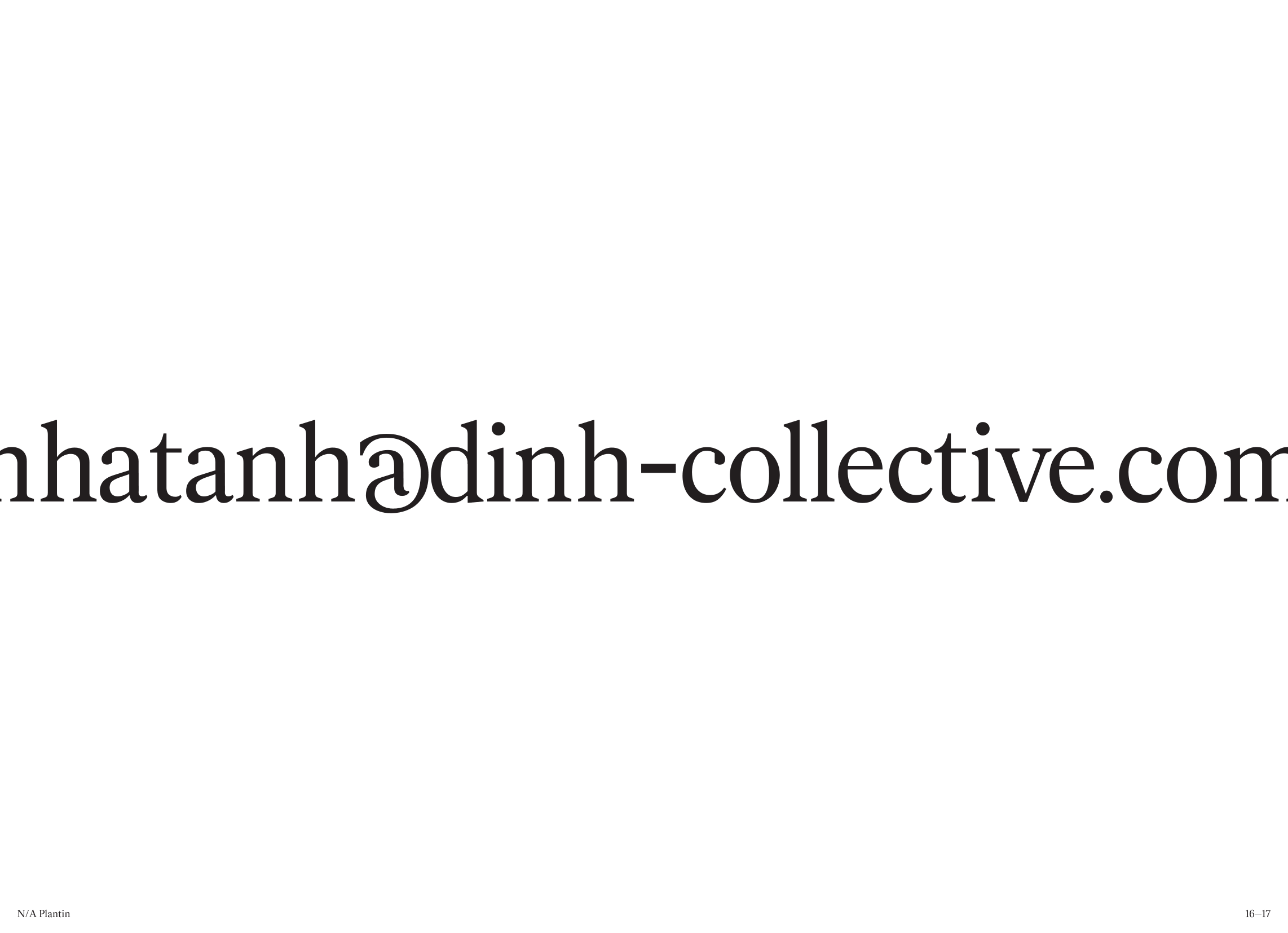
Nguyễn Nhật Ánh
Khóa học
Khoá 02 | Hè 2023
NA Plantin
Thường
NA Plantin
Regular
NA Plantin
Quyển sách
NA Plantin
Existentialism
NA Plantin
N/A Plantin is not Times New Roman. Let’s get that out of the way. It is Plantin Antiqua (by Genzsch and Heyse foundry) developed in a new light.
NA Plantin
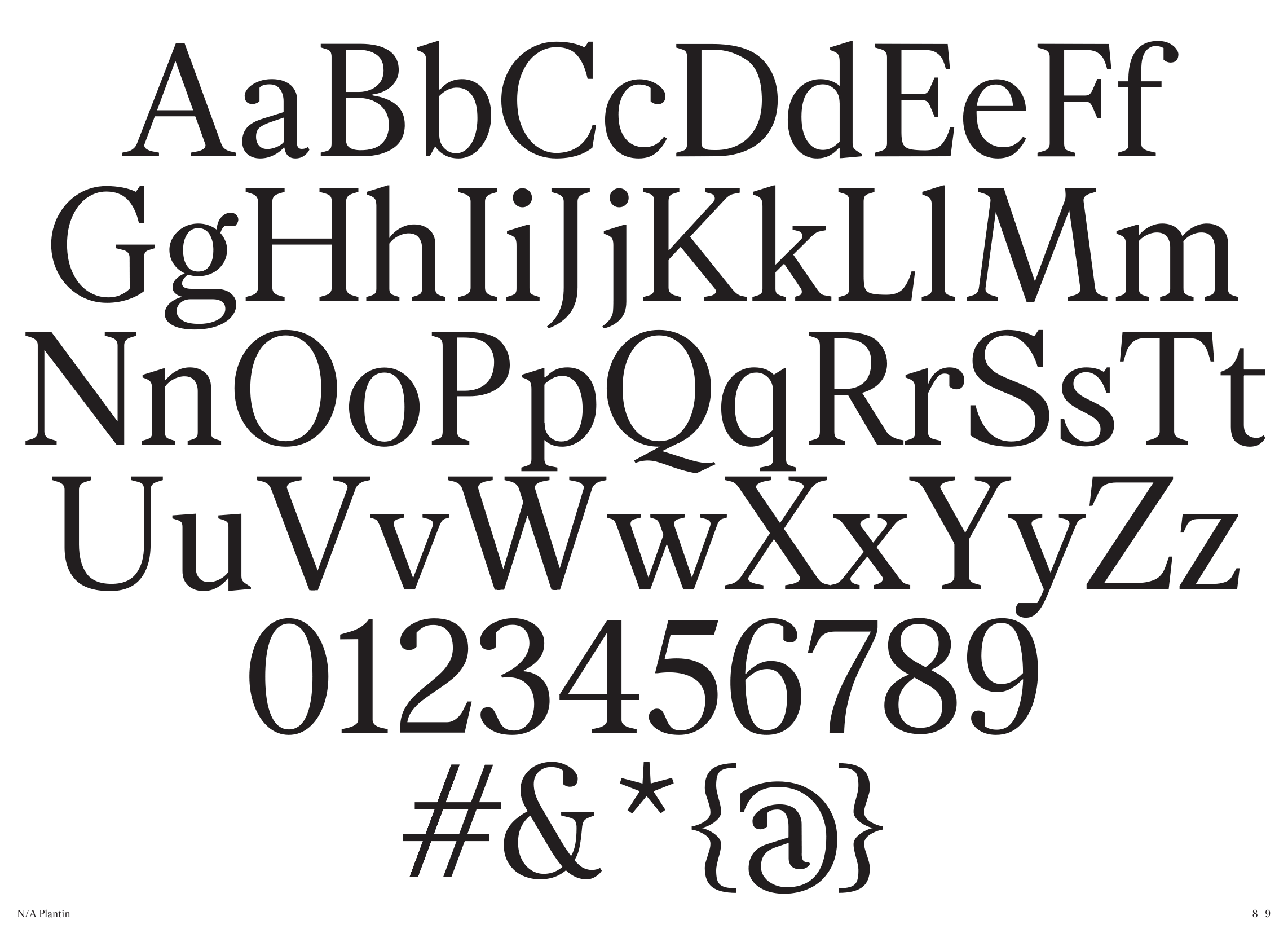
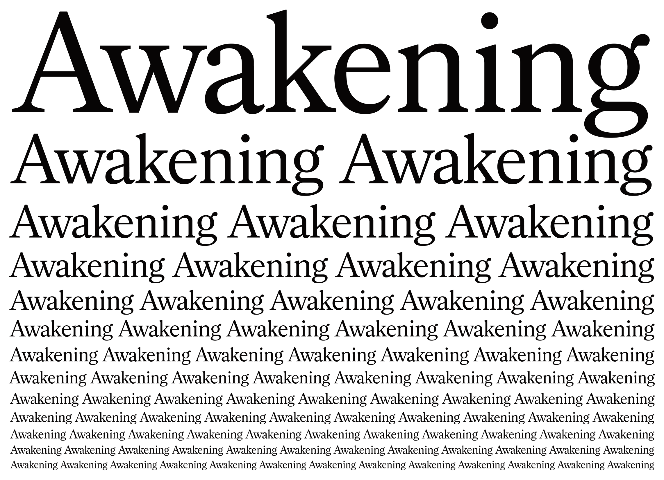
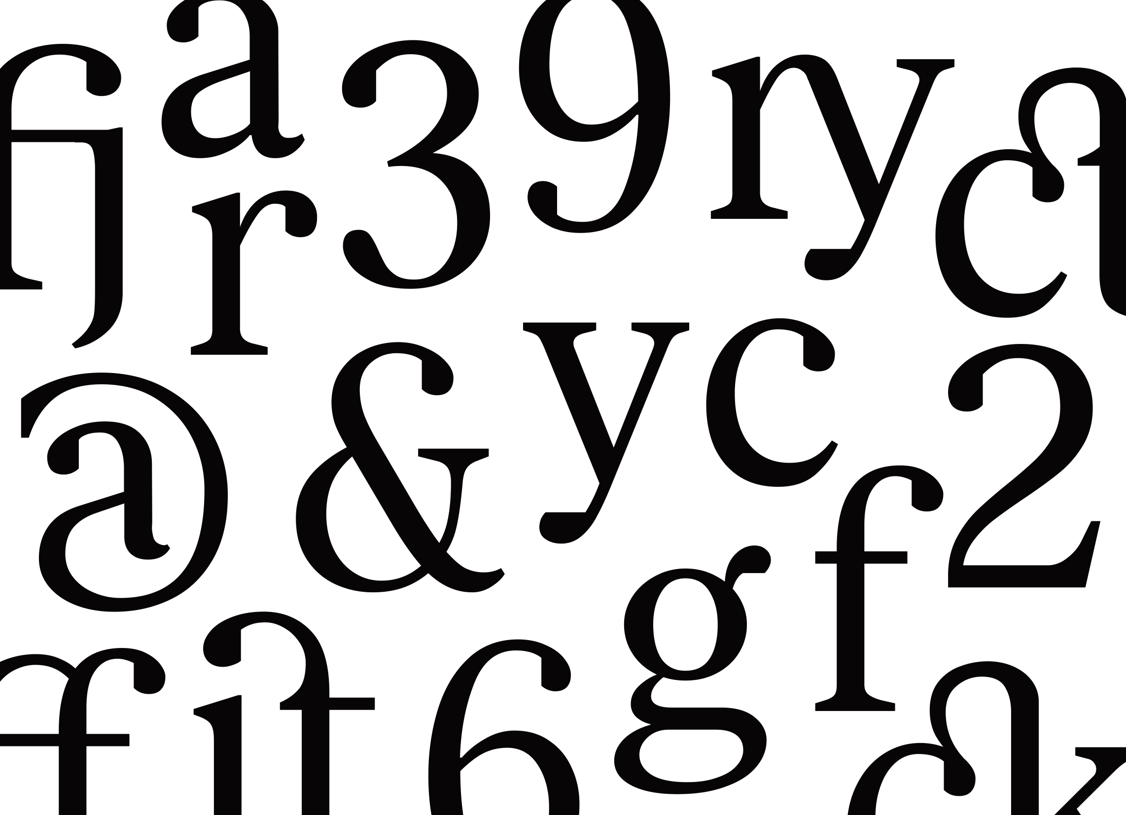
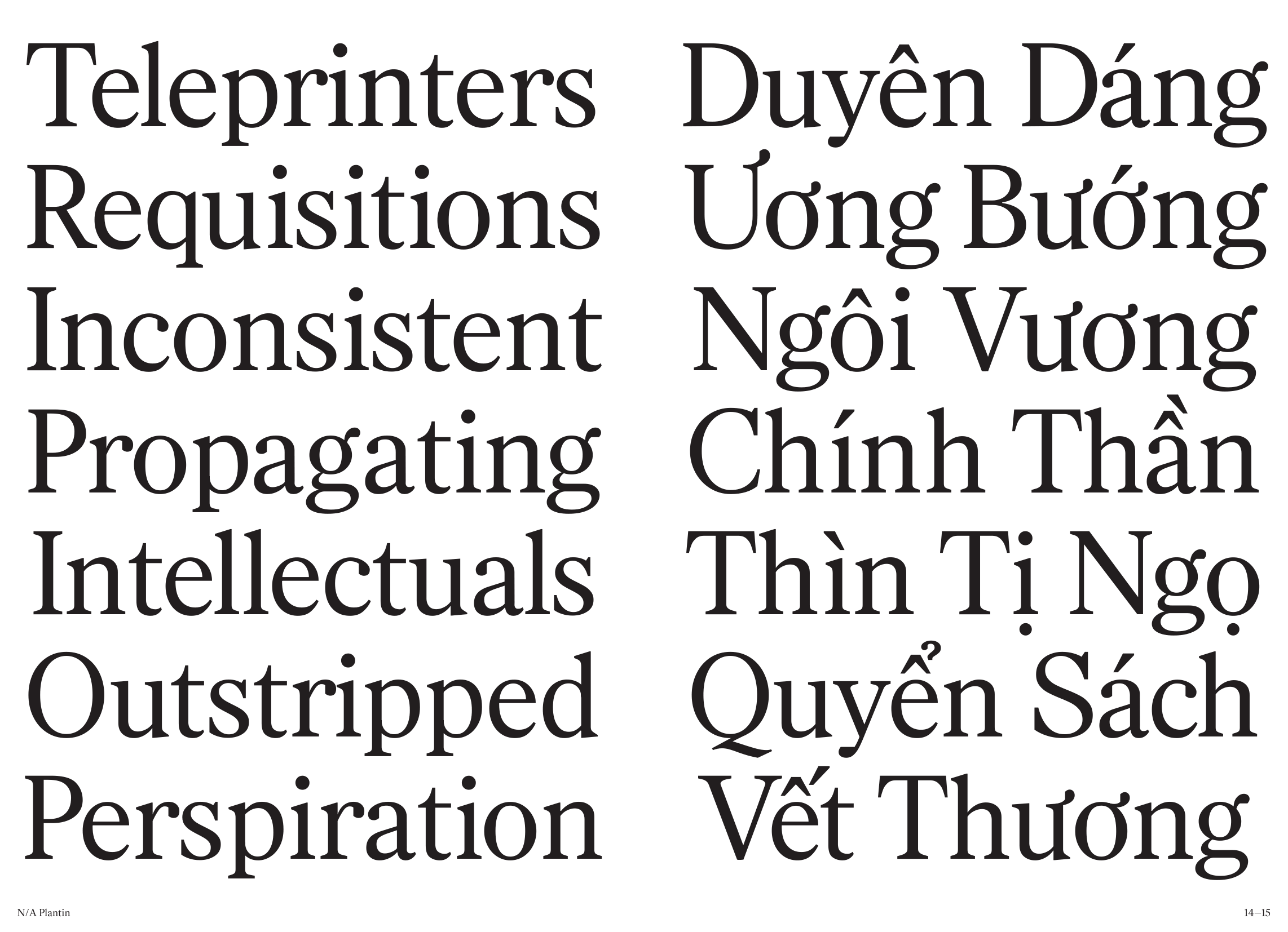
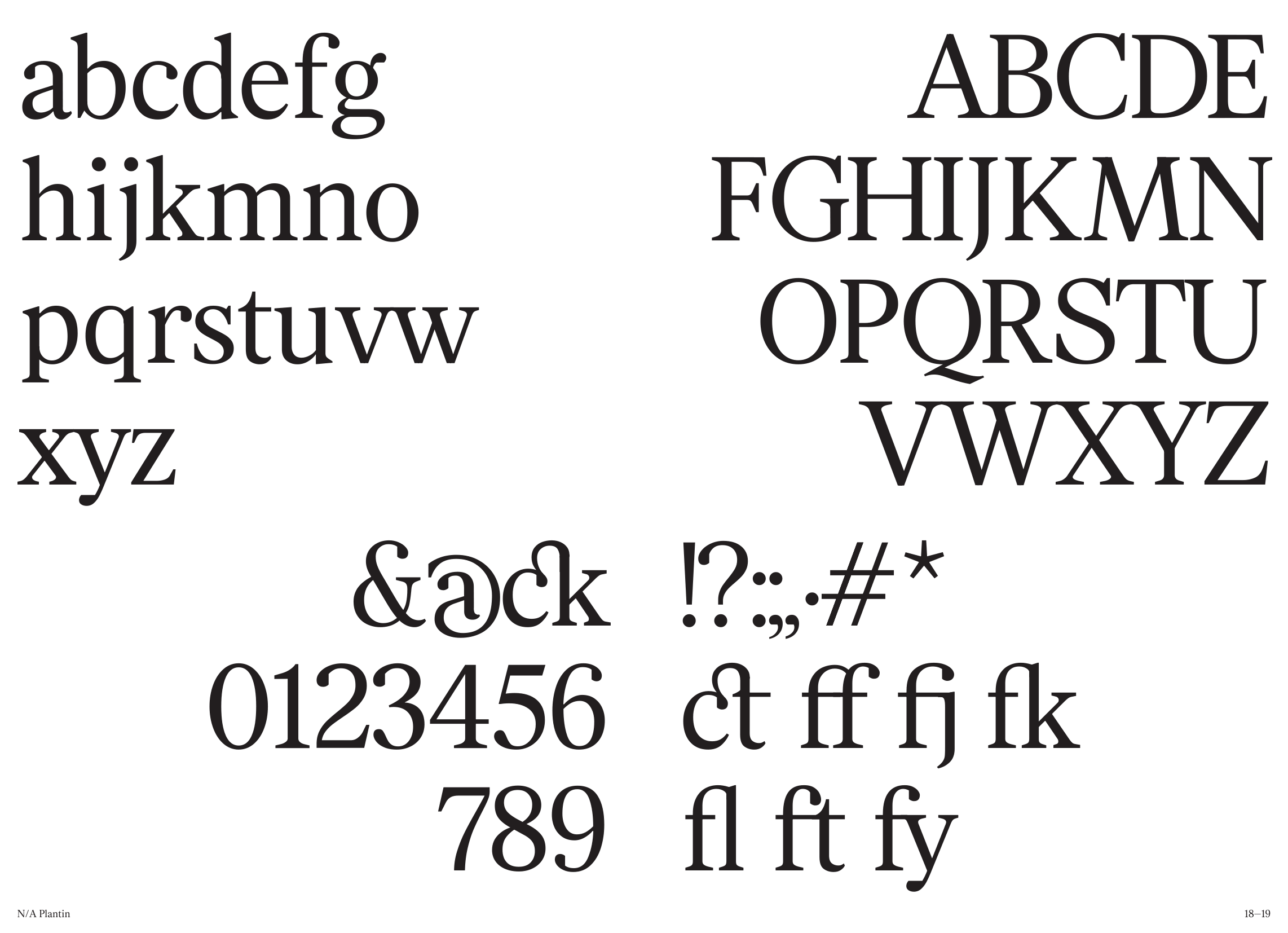
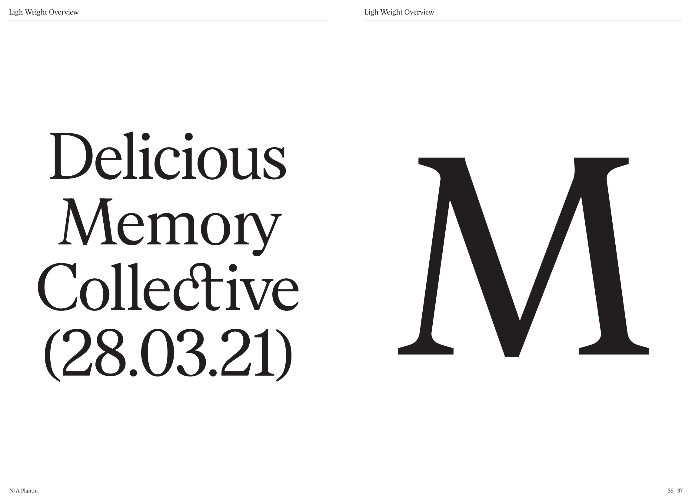
At first glance, N/A Plantin bares close resemblance to other contemporary transitional serifs: fairly tall proportions and even width from one character to another. With its low stroke contrast, the texture is quite lighter than other text type, making this a great option for display. In bigger sizes, N/A Plantin radiates such classic grace from adaptation of its source reference. What molds the identity of N/A Plantin is its contemporary approach with chopped eyedrops and smoother stem-to-serif transition. With all that makes N/A Plantin so unique of itself, this could suits a wide range of applications from logotype to publication in various industries thanks to its tender grace and great agility.
Reading Glyphs...