Pascal
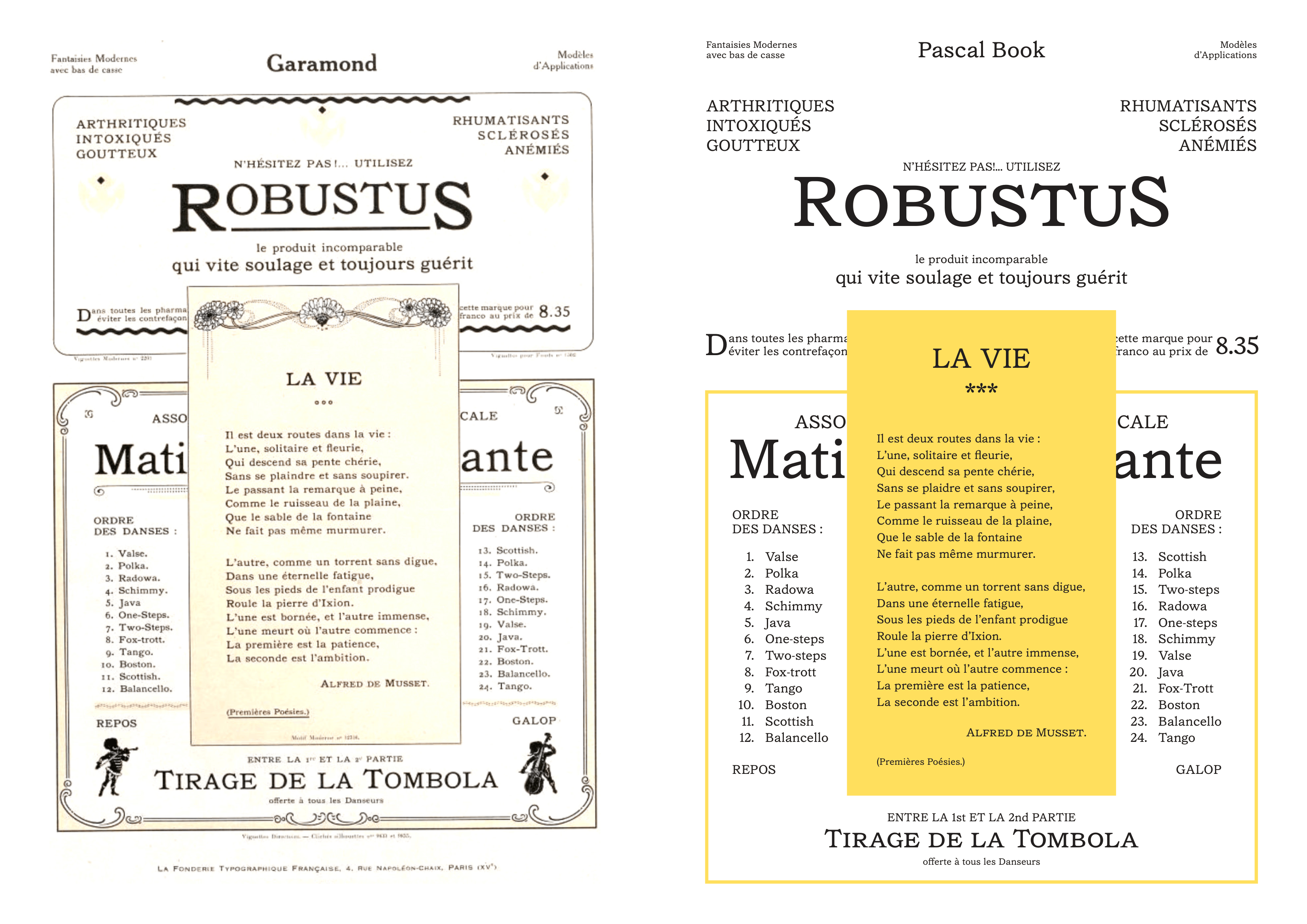
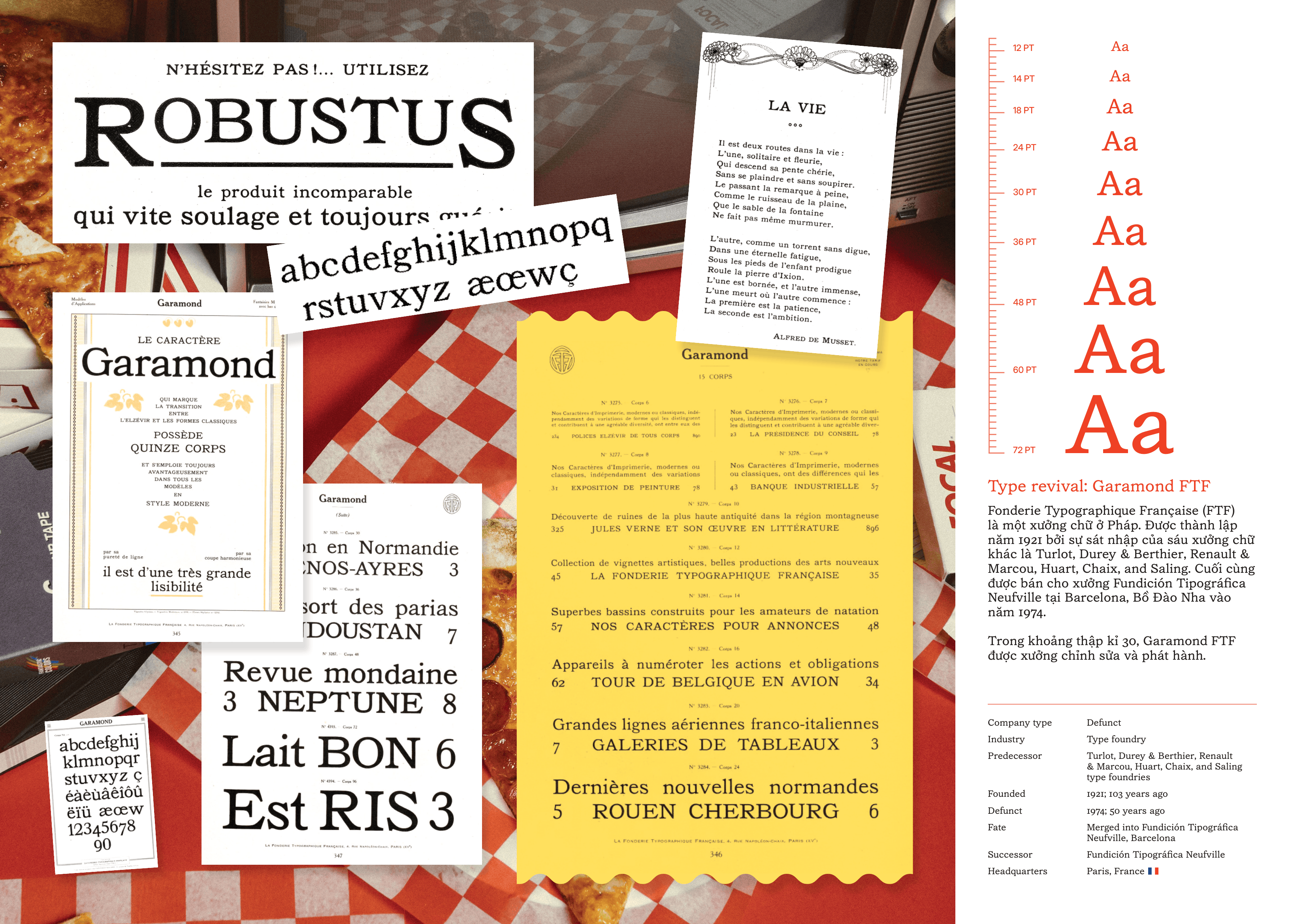
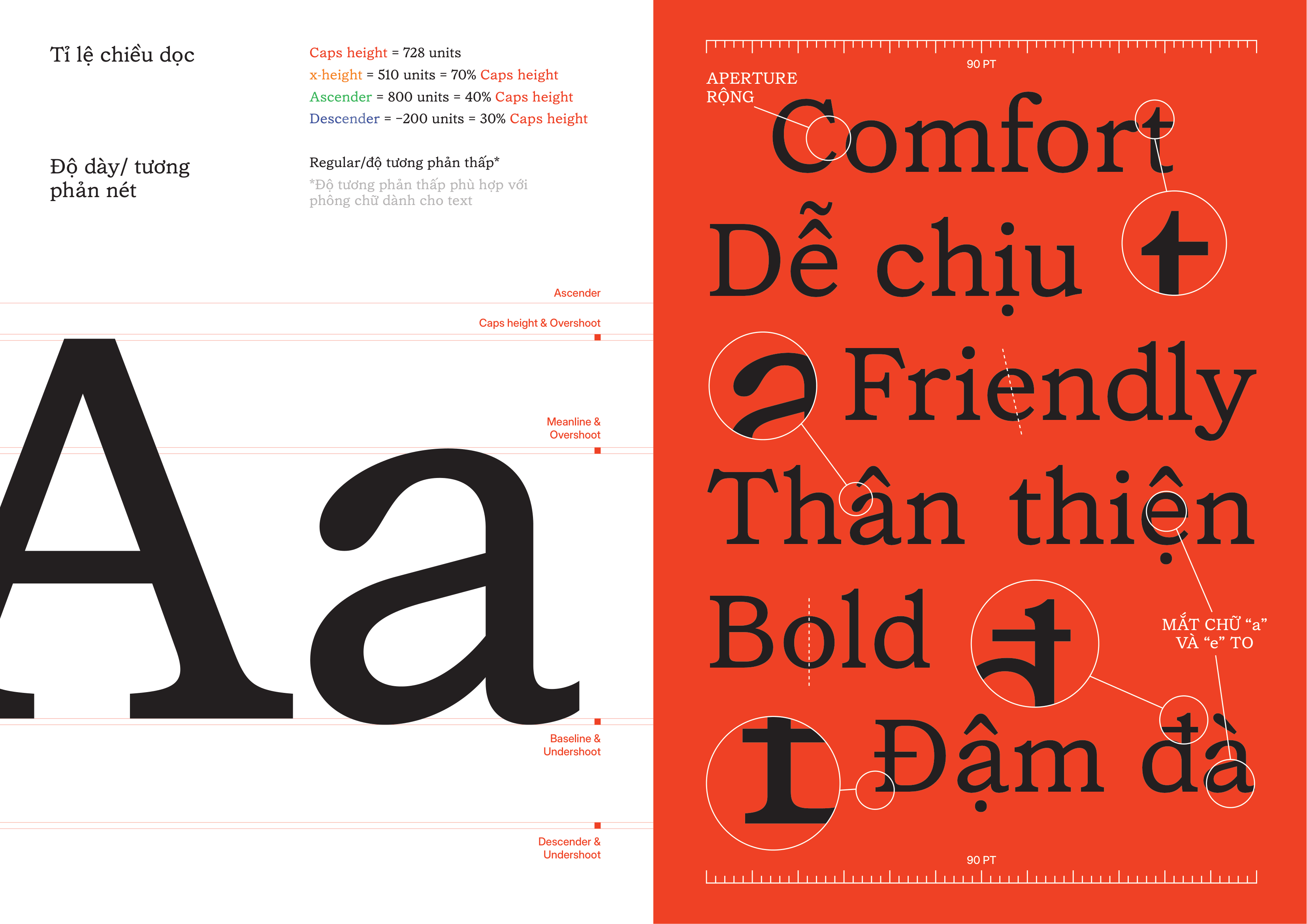
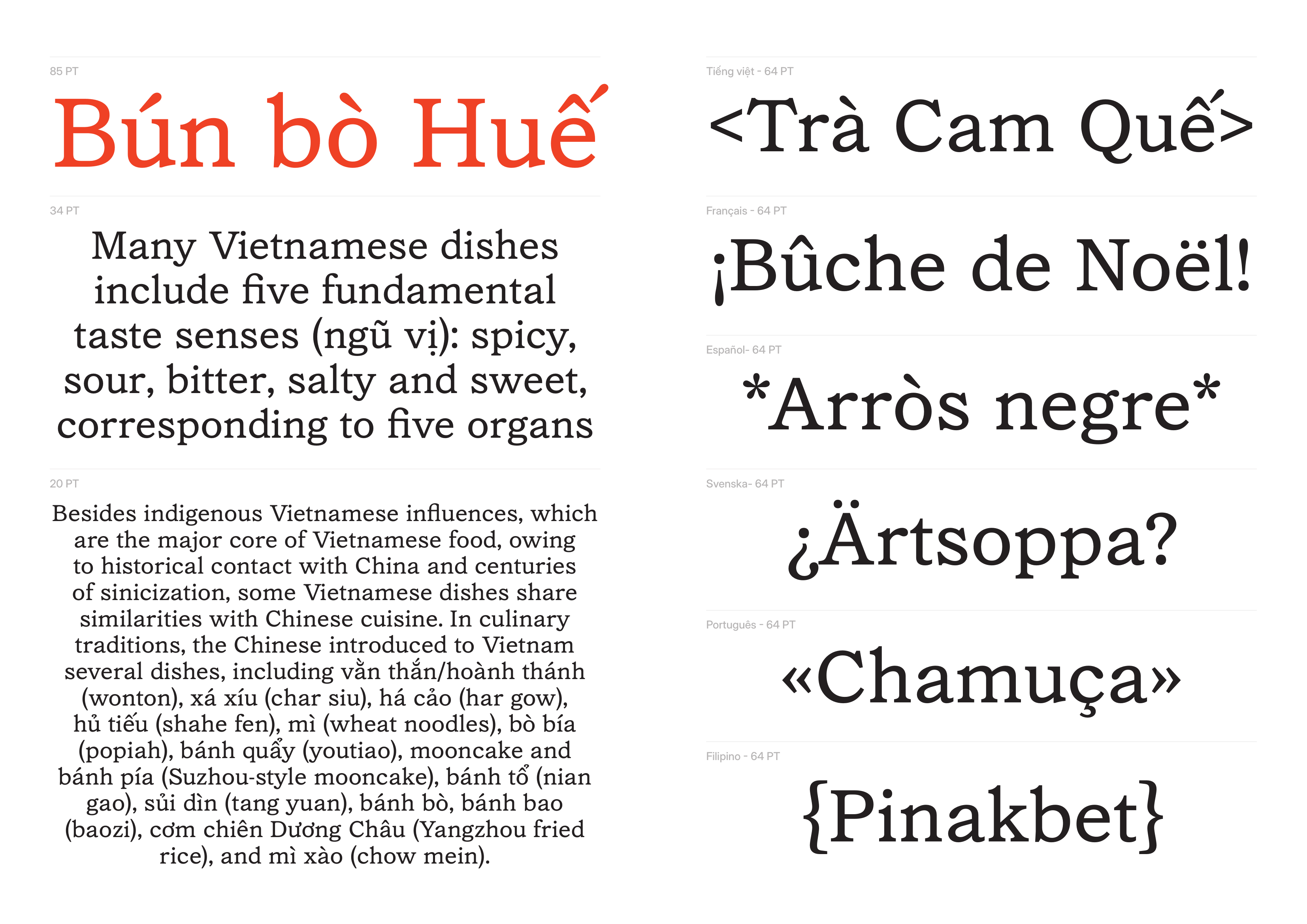
Về Pascal: Pascal làm mới lại phông Garamond của Fonderie Typographie Francaise. Bản Garamond có diện mạo hoàn toàn khác với Garamond thường thấy, là slab serif chứ không phải old style thanh mảnh. Hướng tới làm phông đọc đoạn dài, Pascal có dáng bè và tương phản nét thấp để phân bố các mảng âm dương đều cho mắt dễ lướt.
Dòng phông
Slab Serif
Ứng dụng
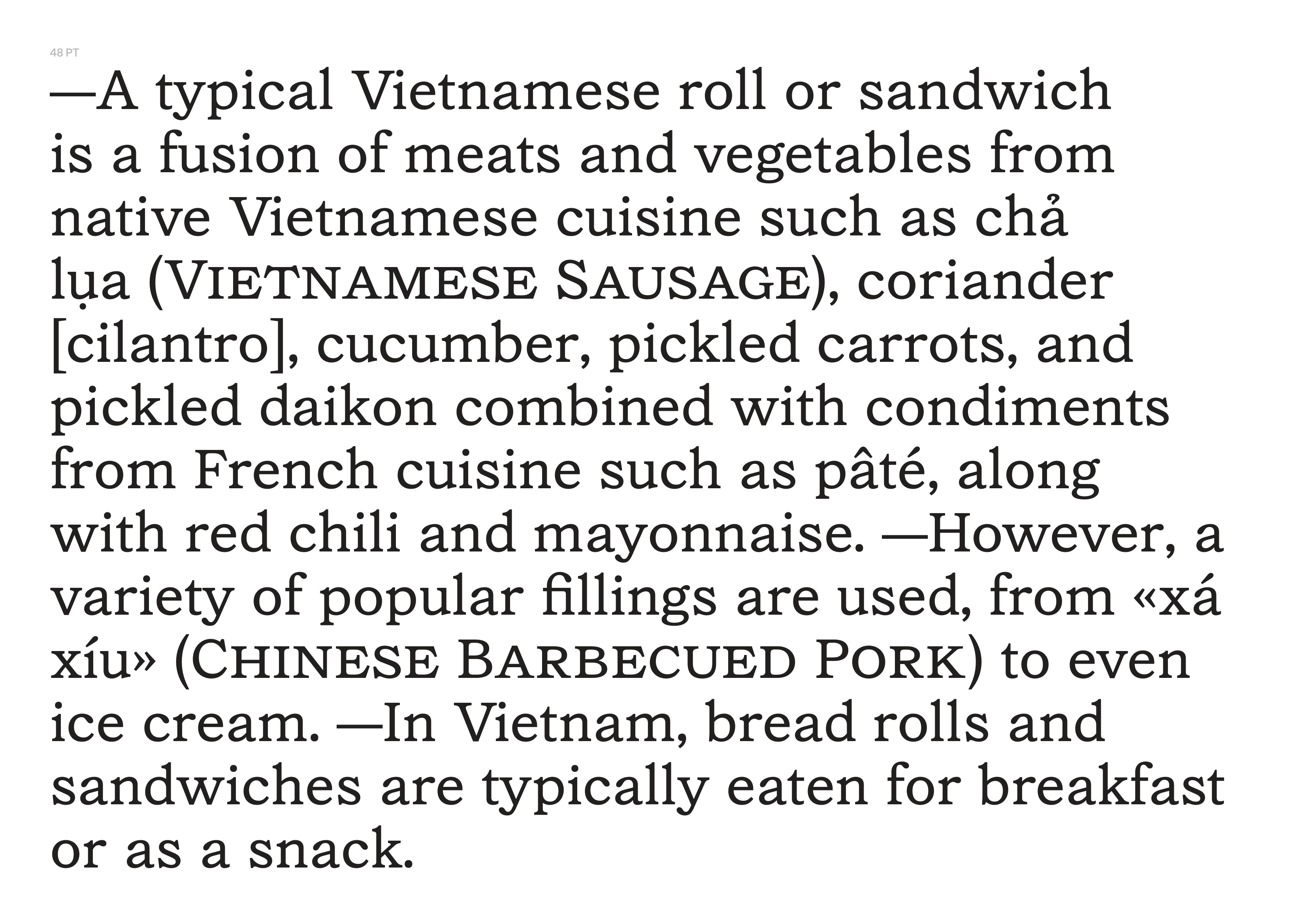
Text
Học viên
Phạm Duy Thái
Khóa học
Khoá 04 | Hè 2024
Pascal
Comfort
Pascal
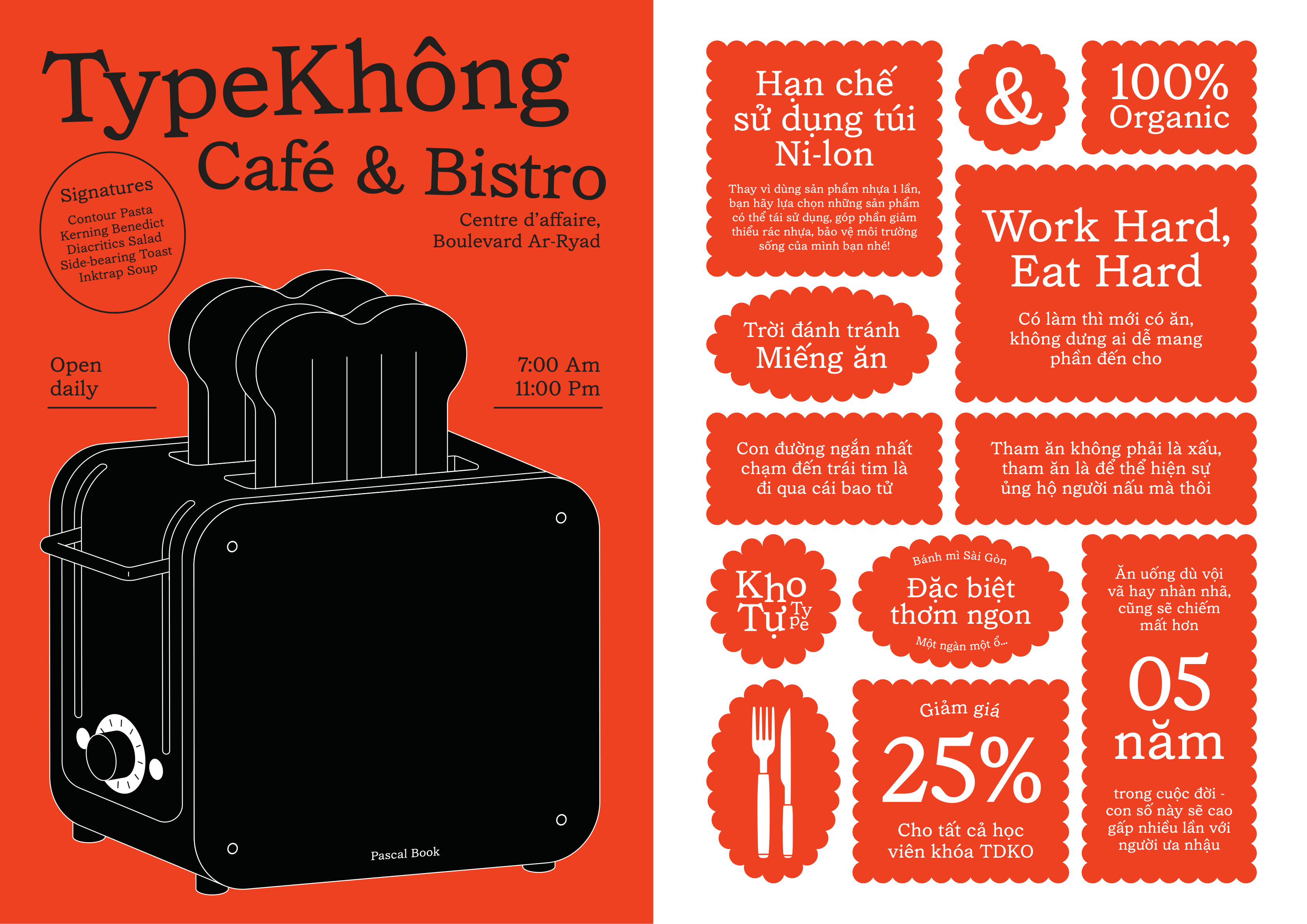
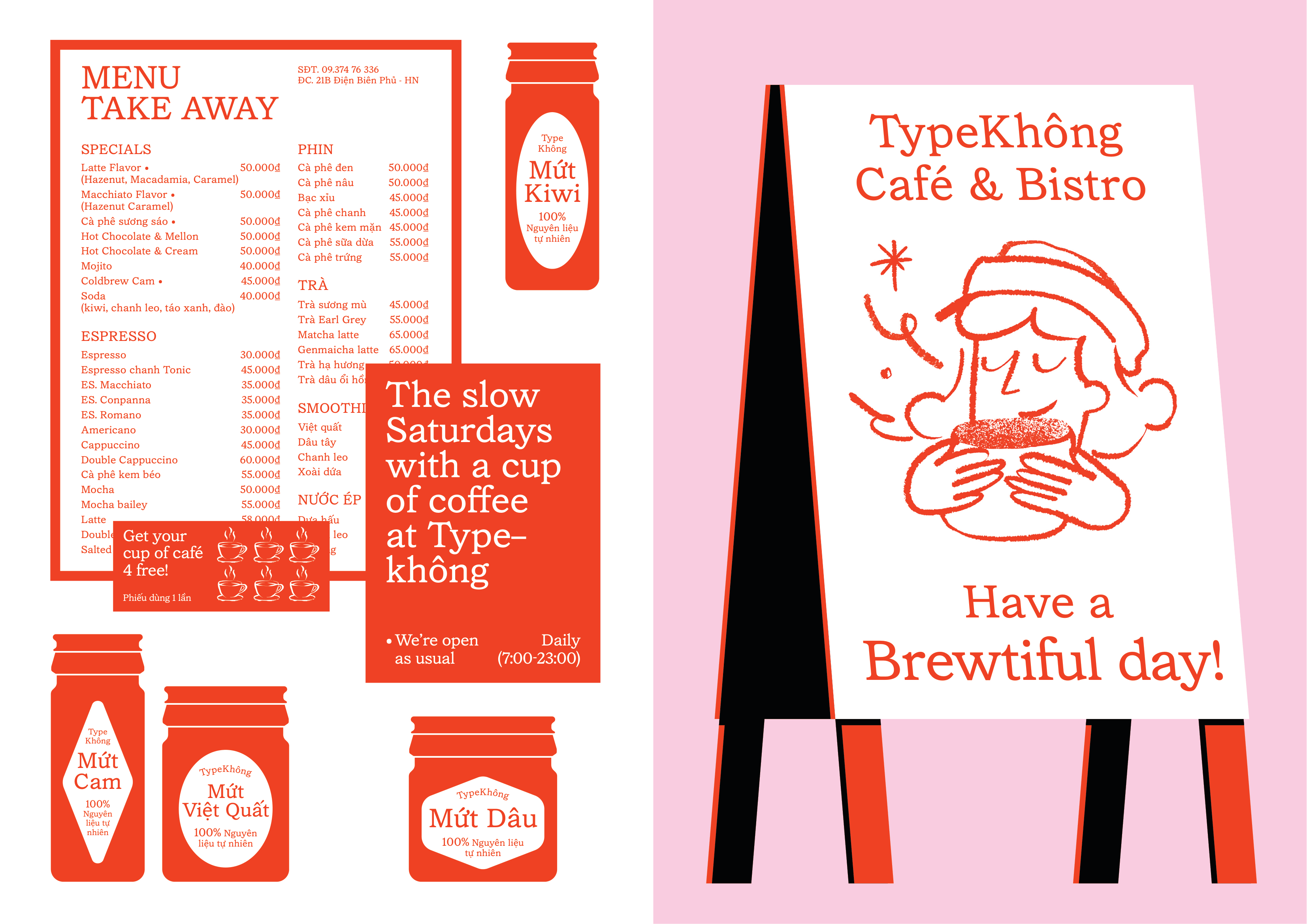
Sour, Bitter, Salty & Sweet
Pascal
Thân thiện
Pascal
Nóng hổi mới ra lò
Pascal
The Garamond produced by the Fonderie Typographique Française should be understood not as a faithful revival of Claude Garamond’s 16th-century work, but as a 20th-century industrial reinterpretation shaped by modern printing needs.
Pascal
By this time, the name “Garamond” had already become a broad label applied to many loosely related old-style typefaces rather than a precise historical model, due to centuries of dispersion, reinterpretation, and confusion with other designers like Jean Jannon. Within this context, FTF’s version likely functioned as a practical, market-oriented book face, adapted for machine composition, contemporary paper quality, and commercial printing, resulting in more regularized forms, slightly heavier strokes, and less calligraphic nuance than Renaissance originals. Rather than aiming for scholarly accuracy, it fits into a wider early 20th-century revival culture, alongside foundries like Deberny & Peignot, where historical references were filtered through modern aesthetics and production constraints. As such, Garamond FTF is best seen as a transitional typographic object: a standardized, industrial version of “classicism” that reflects how historical forms were simplified, stabilized, and circulated in a global printing economy, making it particularly relevant when thinking about how typographic models, like those used in colonial or international contexts, were detached from their origins and reinterpreted in new linguistic and cultural settings.
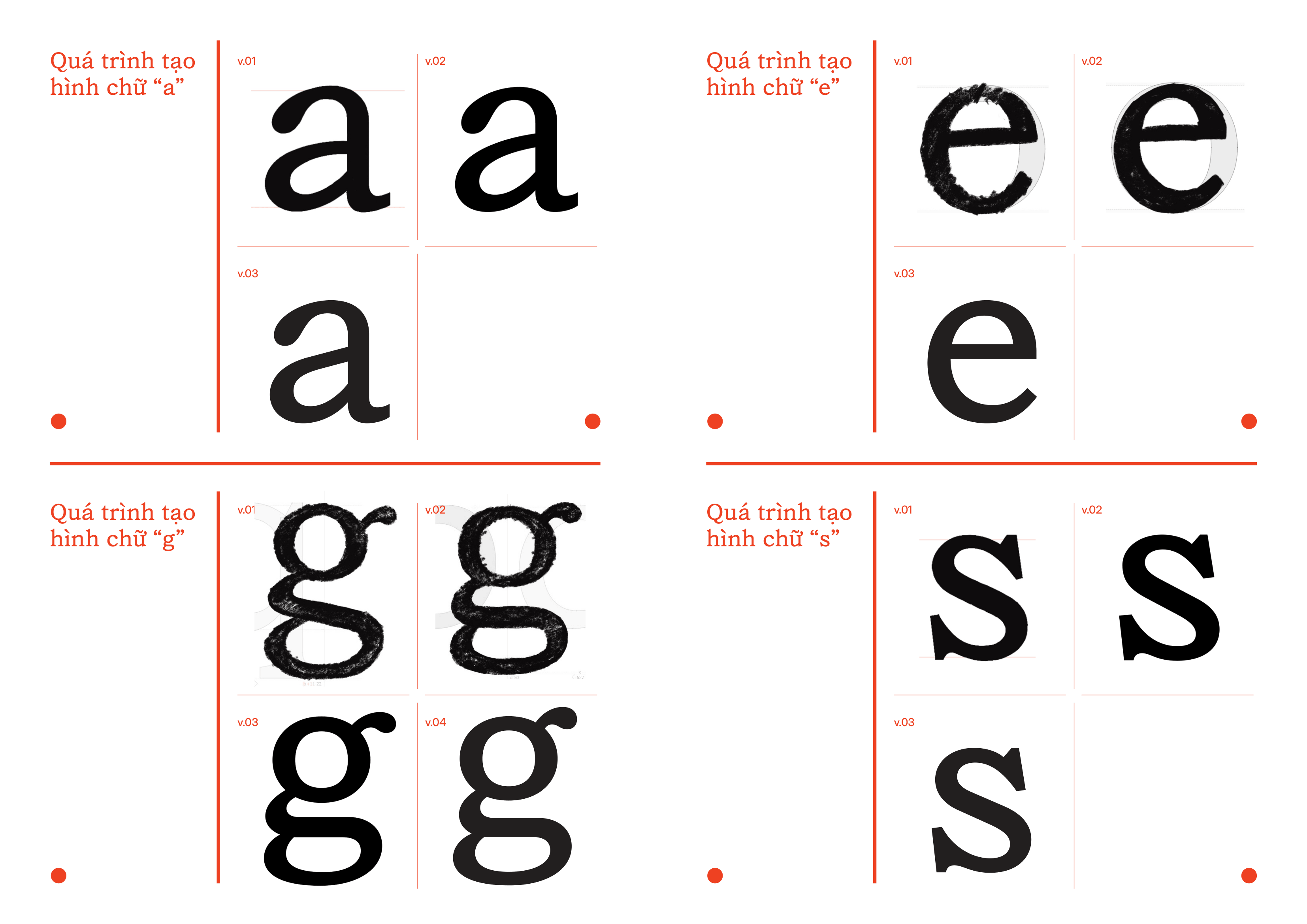
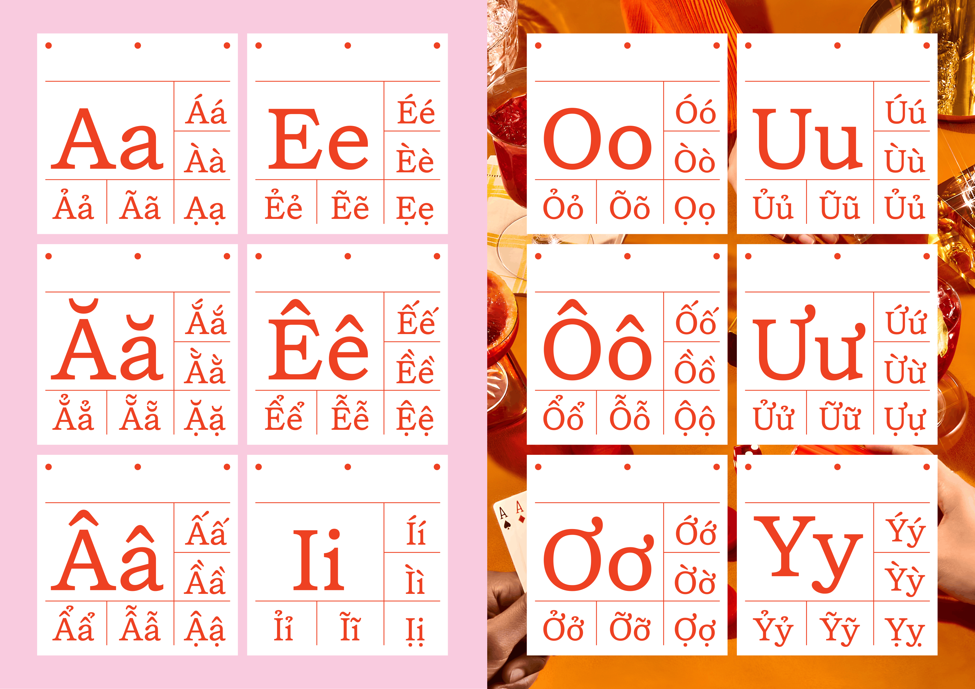
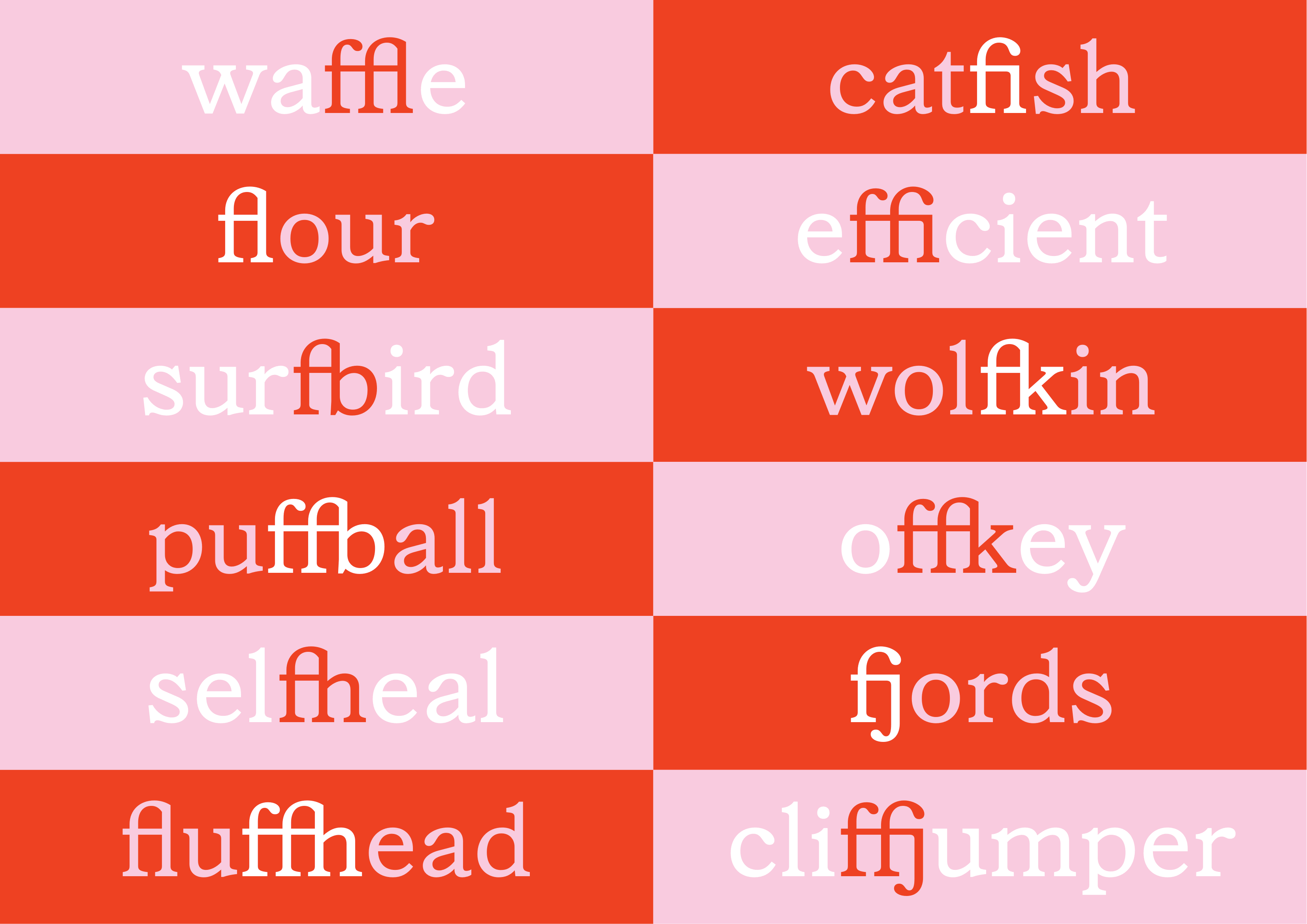
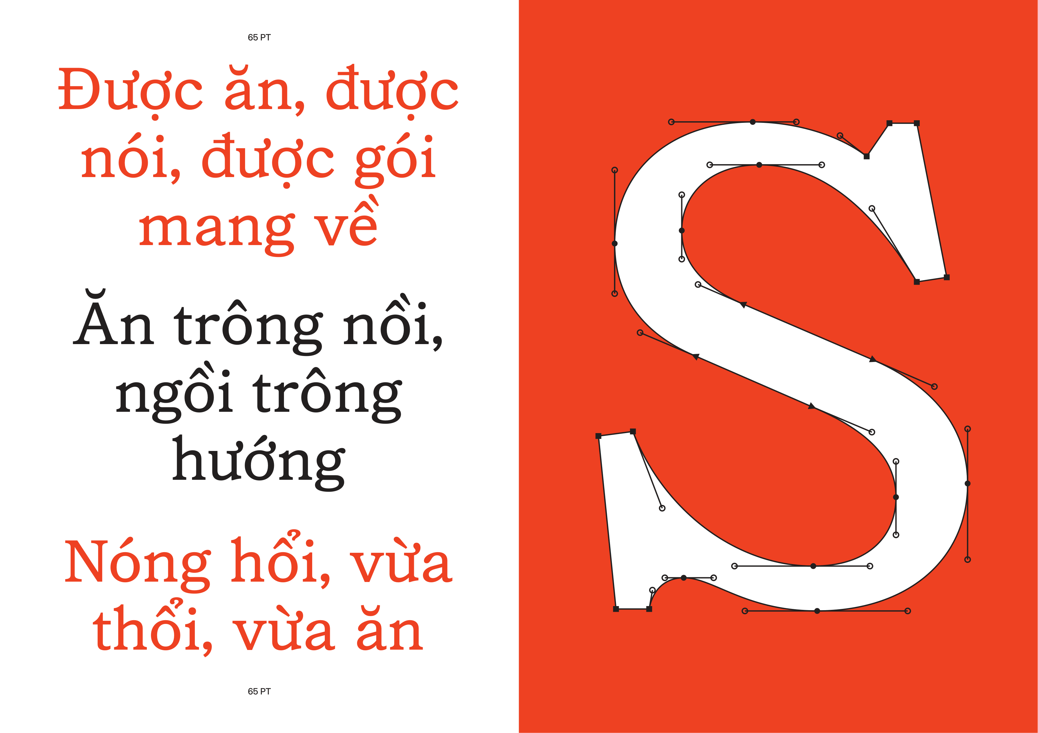
Reading Glyphs...